Previous post

Autism awareness has evolved significantly over the decades, incorporating various symbols and colors that embody the community's diversity, strengths, and ongoing journey toward acceptance and understanding. This article explores the meaning behind these symbols and colors, their historical significance, and how they shape advocacy and societal perceptions of autism.
The puzzle piece is the most recognized symbol for autism today. It was introduced in 1963 by the National Autistic Society and was initially created to represent the complexity and mystery of autism. The interlocking pieces symbolized how autism was seen as a puzzle, with each piece representing different aspects of the spectrum. The bright colors reflected hope and awareness, aiming to foster understanding and acceptance.
Originally, many awareness efforts focused on finding a cure for autism, viewing it largely as a problem to be fixed. Over time, societal perceptions shifted. The narrative moved toward acceptance and the recognition of autism as a natural variation of human neurodiversity. This change led to embracing symbols that celebrate diversity and individual strengths, such as the rainbow infinity symbol.
In recent years, new symbols have emerged. The infinity symbol, often depicted in rainbow colors, signifies the limitless potential of individuals on the autism spectrum and highlights inclusivity and ongoing support. The butterfly has also gained popularity, representing growth, transformation, and the unique developmental journey of autistic individuals. Both symbols emphasize positivity and acceptance, contrasting earlier ideas of cure or normalization.
This evolution in symbolism mirrors a broader societal shift. The focus moved from viewing autism as something to be fixed to appreciating it as part of human diversity. Campaigns like 'Light It Up Blue' and the adoption of the rainbow spectrum reinforce this perspective. The change reflects increasing understanding and respect for neurodiversity, promoting acceptance rather than correction.
| Symbol | Introduced | Represents | Notable Features |
|---|---|---|---|
| Puzzle Piece | 1963 | Complexity of autism | Bright colors, association with awareness campaigns |
| Infinity | 1990s | Infinite potential and neurodiversity | Often rainbow-colored, depicts endless possibilities |
| Butterfly | Recent | Transformation and growth | Symbol of change, diverse developmental paths |
| Blue Light (Light It Up Blue) | 2010s | Awareness and community support | Blue color, landmarks illuminated |
This evolution demonstrates a growing appreciation for the rich diversity within the autism community and a move towards celebrating individual differences rather than seeking to cure them.

The most widely recognized color for autism awareness is blue. This hue is prominently featured in campaigns like "Light It Up Blue," initiated by Autism Speaks, which uses blue lights on landmarks to promote understanding and acceptance. Blue symbolizes calmness, trust, and support, creating a sense of reassurance for those affected by autism and encouraging societal openness.
Beyond blue, several other colors carry meaningful messages within the autism community. The rainbow spectrum is a central symbol representing the vast diversity of experiences, abilities, and challenges faced by individuals on the spectrum. The rainbow infinity symbol, introduced in 2005, employs these vibrant colors to celebrate neurodiversity and limitless potential.
Red is associated with strength and determination, embodying the passionate advocacy of many in the community. Yellow, on the other hand, signifies optimism and hope, inspiring positive perspectives and the desire for societal acceptance.
Symbols also play a vital role in conveying the depth of the autism experience. The puzzle piece, initially created in 1963, symbolizes the complexity and unique nature of autism. However, as understanding has evolved, alternatives like the butterfly and the rainbow infinity symbol have gained popularity. The butterfly, representing transformation and growth, highlights the potential for development and positive change.
In combination, these colors and symbols serve to raise awareness, promote acceptance, and celebrate the diversity and strengths within the autism community. They help foster a supportive environment where neurodiversity is recognized as a natural part of human variation, encouraging society to embrace differences with understanding and compassion.

The infinity symbol, often depicted with rainbow colors, is a prominent emblem representing neurodiversity and the limitless potential of individuals within the autism spectrum. It emphasizes that autism encompasses a vast range of experiences, strengths, and challenges, promoting the idea that every person has endless possibilities. This symbol encourages acceptance, inclusion, and ongoing support, fostering a message that neurodiversity is a natural and valuable part of human variation.
The butterfly, on the other hand, is widely recognized as a symbol of transformation, growth, and the unique development journeys of autistic individuals. It reflects the beauty of differences and signifies positive change, personal development, and the potential for individuals to flourish. The butterfly’s image embodies hope and the ongoing process of adaptation, learning, and self-acceptance within the autism community.
Together, these symbols reinforce the importance of celebrating diversity and encouraging understanding. While the traditional puzzle piece has historically been used to symbolize autism, many community members now prefer the infinity and butterfly icons because of their more optimistic and empowering connotations. These symbols serve to remind society of the value of each person’s unique identity and the endless possibilities for growth and acceptance.

The symbols and colors associated with autism have seen significant changes over the decades, reflecting shifts in societal perceptions and awareness efforts. Initially, the most recognizable symbol was the rainbow-colored puzzle piece, introduced in 1963 by the National Autistic Society. This image aimed to represent the complexity of autism and the mystery surrounding it. The puzzle piece was created to symbolize the puzzling nature of autism but also became a rallying icon for awareness campaigns.
However, over time, the puzzle piece faced criticism. Some autistic individuals felt it implied that autism was a problem to be fixed or missing, which did not promote an inclusive perspective. Consequently, newer symbols began to emerge. The infinity symbol, often in rainbow or gold colors, has become popular for representing neurodiversity, unlimited potential, and the ongoing journey of acceptance.
Similarly, the butterfly has been introduced as a symbol of transformation, growth, and the diversity within the autism community. It signifies change, hope, and the natural development of autistic individuals.
Colors have also evolved from rigid associations to broader representations of the spectrum's diversity. Blue remains the most widely recognized color, especially due to the 'Light It Up Blue' campaign by Autism Speaks, symbolizing calmness, trust, and acceptance. Nonetheless, other colors like red — exemplifying strength and resilience — yellow, which symbolizes hope and optimism, and gold, representing strength and societal acceptance, have gained importance.
The rainbow spectrum itself now reflects the wide range of abilities, experiences, and challenges encountered by autistic individuals. This shift from a focus on curing autism to embracing neurodiversity promotes inclusion, understanding, and respect.
Overall, the evolution of autism symbols and colors marks a transition from viewing autism as a condition to be fixed to recognizing it as a natural variation of human neurodiversity. Today, the symbols and colors are tools to foster acceptance, celebrate differences, and highlight the strengths within the community, embodying a more inclusive and empowering perspective.
 When selecting symbols and colors for autism awareness, it is essential to consider the sensory sensitivities and cultural perceptions of the community. Many autistic individuals experience heightened sensory sensitivities, making the choice of colors particularly important.
To promote comfort and inclusivity, softer, calming hues such as pastels and muted tones are often preferred. These colors tend to be gentle on the eyes and less likely to cause sensory overload or discomfort. For example, pastel pinks, light lavenders, soft greens, and muted blues create a soothing visual environment conducive to promoting awareness without overwhelming viewers.
In contrast, some colors should be avoided to prevent negative reactions or overstimulation. Bright, neon shades are especially problematic, as their high intensity can cause agitation or irritability. Intense reds, which are often associated with passion or urgency, might also evoke feelings of aggression or overstimulation in some individuals.
White and other highly saturated colors are generally not recommended either, as they can appear too bright or glaring, especially for those sensitive to light. This can inadvertently induce discomfort or reduce engagement with awareness campaigns.
A helpful approach involves using a palette of pastel blues, soft greens, and gentle purples, which are both soothing and symbolically supportive of autism awareness. These colors also align with the commonly used blue associated with campaigns like 'Light It Up Blue' by Autism Speaks, which emphasizes calmness and trust.
Cultural differences may also influence how specific colors are perceived or valued. Therefore, it is important for awareness campaigns to consider local cultural contexts and sensitivities to avoid misinterpretation or unintended offense.
In summary, selecting non-overstimulating, culturally neutral, and calming colors can make autism awareness efforts more effective and welcoming. Prioritizing comfort for autistic individuals and sensitivity toward diverse responses to color enriches the outreach and helps foster a more understanding society.

There is no strict or universally mandated order for autism awareness colors and symbols, as their use varies among campaigns and organizations. The most recognizable color is blue, especially highlighted during the "Light it Up Blue" campaign by Autism Speaks, which aims to promote awareness and foster acceptance.
Other colors have specific associations: red symbolizes strength and passion, yellow represents hope and optimism, and gold stands for acceptance and recognizing talents within the autism community.
Regarding symbols, the puzzle piece is the most familiar, symbolizing the complexity and diversity of autism. The rainbow spectrum signifies the broad range of experiences, and the infinity symbol highlights the limitless potential of individuals. These symbols are often used together but do not follow a particular hierarchy or sequence.
Most importantly, these colors and symbols serve as tools to promote understanding, support, and inclusivity. Their use varies according to cultural or regional preferences, with different organizations emphasizing different aspects of autism awareness.
In summary, while certain colors and symbols have become widely associated with autism, there is no prescribed order for their use, allowing flexibility to celebrate diverse insights and individual experiences within the autism community.
As awareness efforts continue to grow and evolve, the symbols and colors associated with autism serve as powerful tools to foster understanding, celebrate diversity, and promote acceptance. Moving beyond early representations, the community now embraces symbols like the infinity ribbon and butterfly, which underscore neurodiversity, personal growth, and limitless potential. Recognizing the cultural and sensory sensitivities of autistic individuals, the thoughtful use of calming, inclusive colors enhances the effectiveness of awareness campaigns. Ultimately, these symbols and colors are more than visual cues—they embody hope, respect, and the ongoing commitment to a more inclusive society.

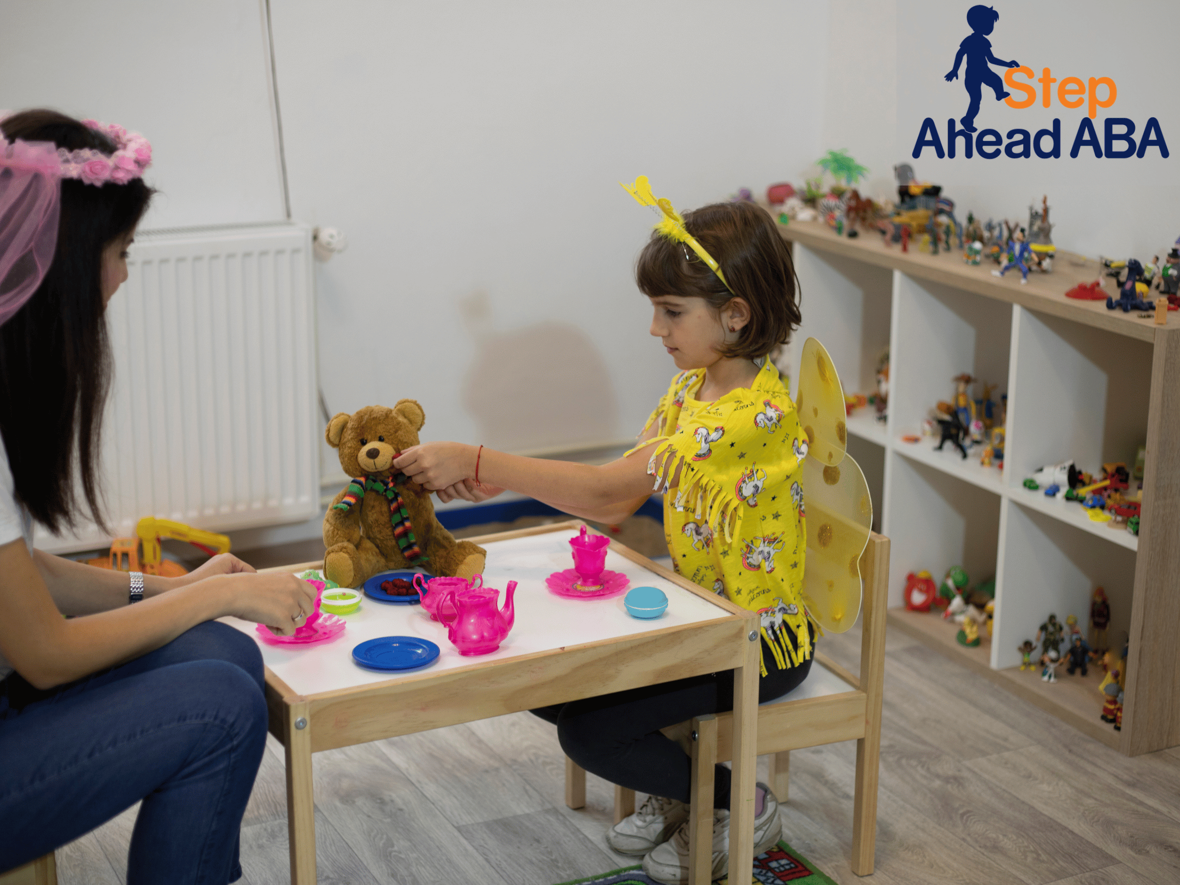
Our company offers expert in-home ABA therapy for ages 1-21, by qualified therapists who care. We’re improving lives for families with top-tier therapy that is accessible, flexible and effective.


.png)